
How do I decide on a siding color for my home? – Part 2
In our previous blog post – How do I decide on what siding color we discussed step-by-step approach to help you make the best decision. In this blog we want to cover some color combination options for your home.
There are several siding colour combinations that are popular across Canada, and many cater to our diverse climates, architectural styles, and natural surroundings. Below are four trending palettes with images and notes on why they work well. You can use these as inspiration and then tweak them to your home’s specific situation.
Classic Neutrals: Greys, Whites & Soft Beiges Siding Examples
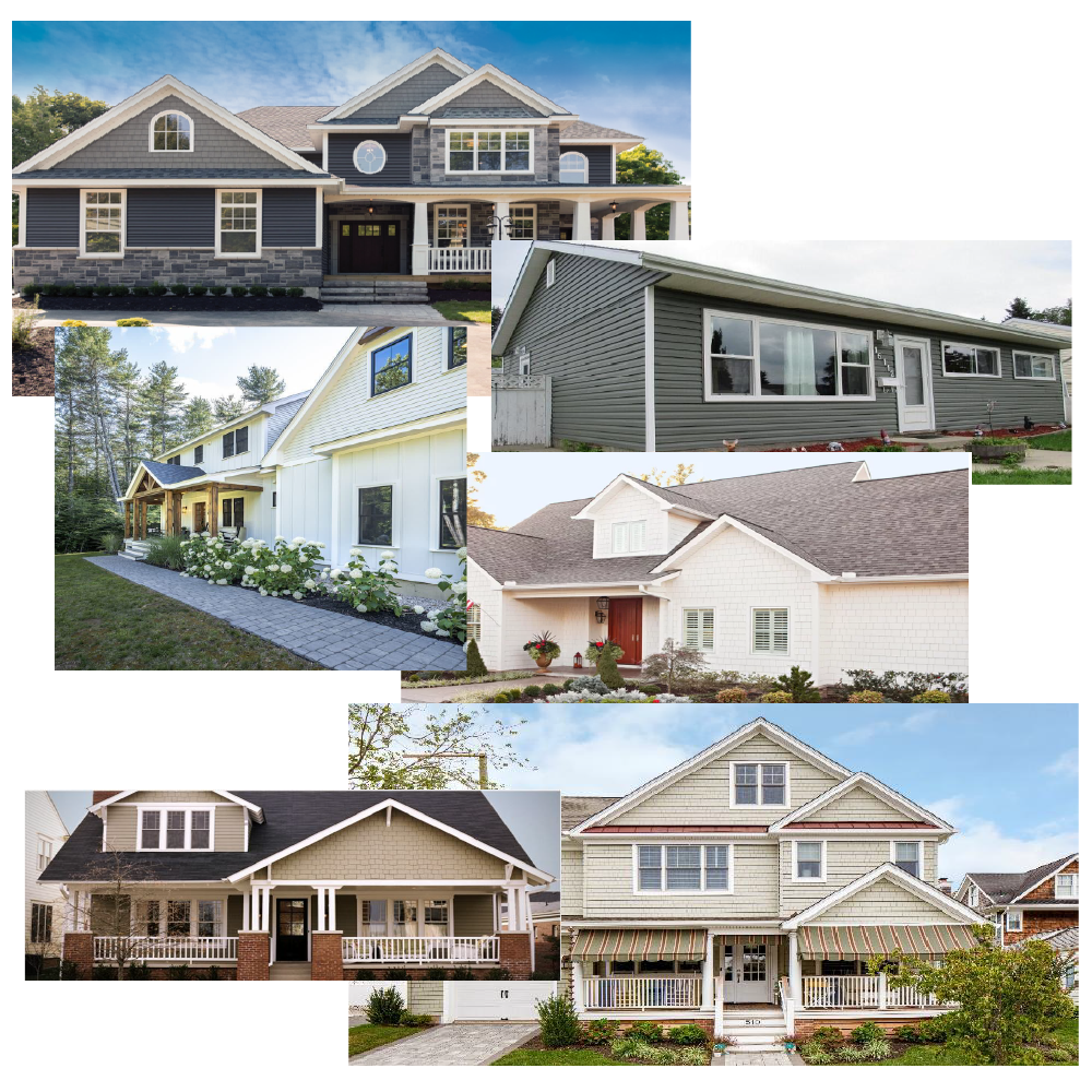
Why these work:
Neutrals like light grey, off-white and beige provide a clean backdrop that goes with many roof colours, stone/brick details and landscaping. For example, the colour “Arctic White” is cited as a timeless choice. (James Hardie)
In Canada’s varied light (bright snow, summer sun, overcast skies), these softer tones hold up well and don’t feel overly “cold” or stark.
Popular for resale and broad appeal.
Good combinations:
Main siding: light grey (or warm grey) → Trim & accents: crisp white or off-white
Main siding: beige or “greige” (grey/beige hybrid) → Trim: a slightly darker or lighter beige/cream
Things to watch:
Too much match-y “all one colour” can look flat; using subtle contrast in trim or accent helps.
Dramatic Contrast: Dark Bodies with Light Trim / Bold Accents Siding Examples
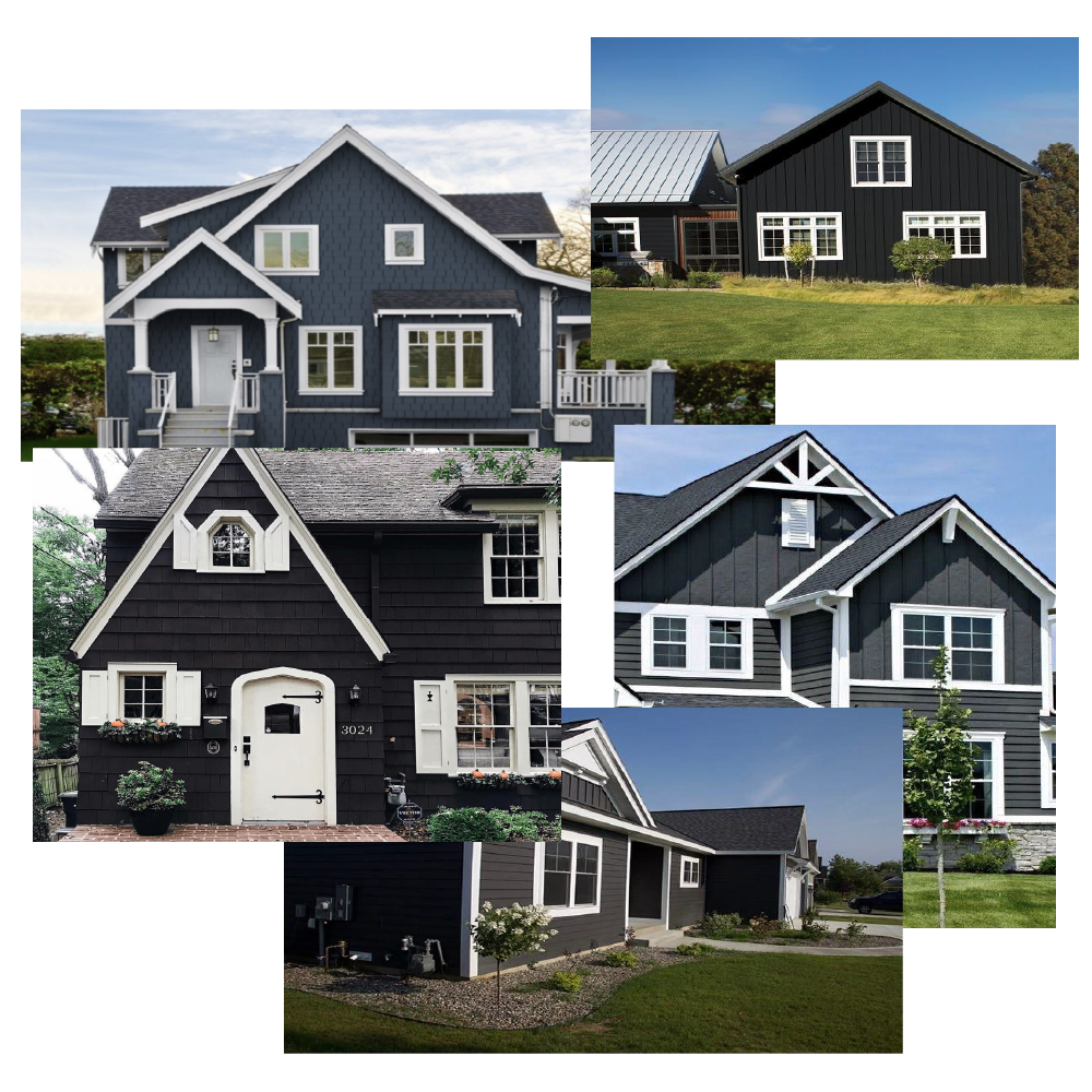
Why these work:
Darker siding colours (charcoal, deep grey, navy, black) are gaining popularity in Canada for a modern, defined look. (westwoodsiding.ca)
Paired with light/white trim, they give crisp lines, highlight architectural features, and give a luxurious or contemporary feel.
They contrast well with snow and are striking in winter landscapes.
Good combinations:
Main siding: deep charcoal or “Iron Gray” → Trim: Arctic White or similar. (Note: “Iron Gray” is cited as a popular choice in Canadian homes. (uat.jameshardie.com) )
Main siding: navy or deep blue → Trim: white or very light grey → Accent: warm wood tone (e.g., front door)
Things to watch:
Dark colours absorb more heat and show dust or fading more than light colours — especially relevant in Canadian sun/UV conditions.
On smaller homes or heavily shaded lots, very dark siding may make the building feel smaller unless offset by lighter trims or accents.
Earthy & Natural Tones: Sage, Browns, Taupes, Greens Siding Examples
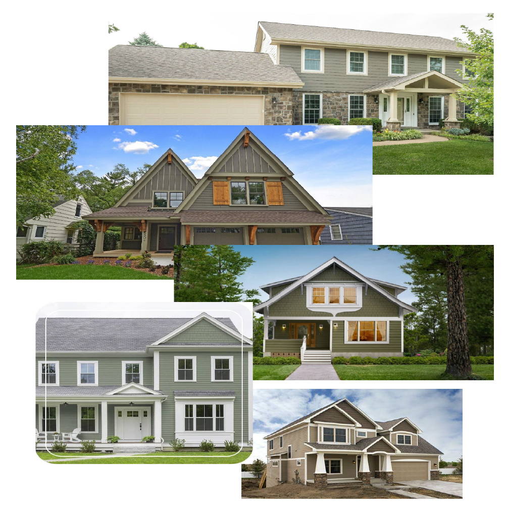
Why these work:
These colours blend with natural surroundings (trees, stone, wood) — which is especially relevant in Canadian suburban and rural settings. For example, “earthy tones — grey, chestnut brown, beige” are rising in popularity. (renoassistance.ca)
Soft greens like sage offer subtle colour without being too bold; they sit well in both nature-rich and urban landscapes. (westwoodsiding.ca)
Good combinations:
Main siding: warm taupe/brown → Trim: muted cream or off-white → Accent: dark brown or black
Main siding: sage green (with grey undertone) → Trim: white or very light grey → Accent: natural wood door or stone details
Things to watch:
Some of these tougher tones may feel trendy; ensure you like it long-term.
Matching surrounding materials (stone, roof, brick) is important because these colours lean into existing textures.
White/Off-White with Accents: A Fresh, Clean Base Siding Examples
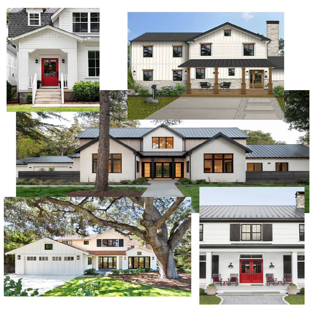
Why these work:
A white/cream base is timeless and nearly universal in appeal. “Arctic White” is again cited as a go-to. (James Hardie)
White siding allows you to highlight doors, shutters, trim, and architectural features with colour or texture.
Especially good when you have stone, wood, or metal accents: the white lets them pop.
Good combinations:
Main siding: bright white/off-white → Trim: black or dark charcoal → Accent: vibrant door colour (red, deep blue, wood)
Main siding: cream/off-white → Trim: warm grey → Accent: natural wood or soft colour (sage, muted red)
Things to watch:
Pure white can be hard to keep clean (snow, dust, age).
Make sure the white is compatible with roof colour (e.g., avoid a white siding that's too close to the roof’s light colour, causing everything to blend and look flat).
Deep Red Siding Examples
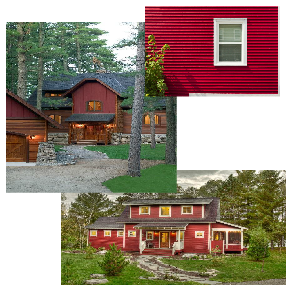
Why these work:
Red siding is less common, so it gives your home strong curb appeal and personality.
Colour options such as Countrylane Red from one major manufacturer are described as “bold, distinctive, warm, inviting.” James Hardie+1
Works especially well if you’re aiming for a statement or a home that stands out.
Good combinations:
Main siding: deep red (barn red, country lane red) → Trim: crisp white or off-white → Accent: black/charcoal or natural wood
If you prefer less intensity, you could use red on a portion of the siding (gable, upper floor) and keep the rest neutral.
Things to watch:
Because red is a strong colour, ensure it complements your roof, stone/brick, and surrounding landscape.
Test the red in different lighting (morning sunlight, evening, snowy conditions) — red can appear very different under different light.
Maintenance: bold colours may show fading, especially in bright sun or harsh climate cycles.
| Base Siding Colour Palette | Siding Trim/Accent Suggestions |
|---|---|
| Light grey/beige neutral | White/off-white trim, subtle accent |
| Dark body (charcoal, navy) | White/light trim, wood or bright door accent |
| Earthy tones (taupe, sage, brown) | Cream or soft trim, natural material accents |
| White/off-white | Contrasting dark trim or bold accent door |
| Deep red palette | Unique, character-rich, statement-making |